ARREL
Brand Identity & Visual System
Role
Brand identity · Concept Development · Art direction · Packaging · Graphic design
Tools
Adobe Illustrator · Adobe Photoshop · Adobe InDesign
Year
2026
Arrel began as an open-ended exploration: the creation of a café from a completely blank canvas.
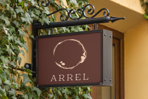
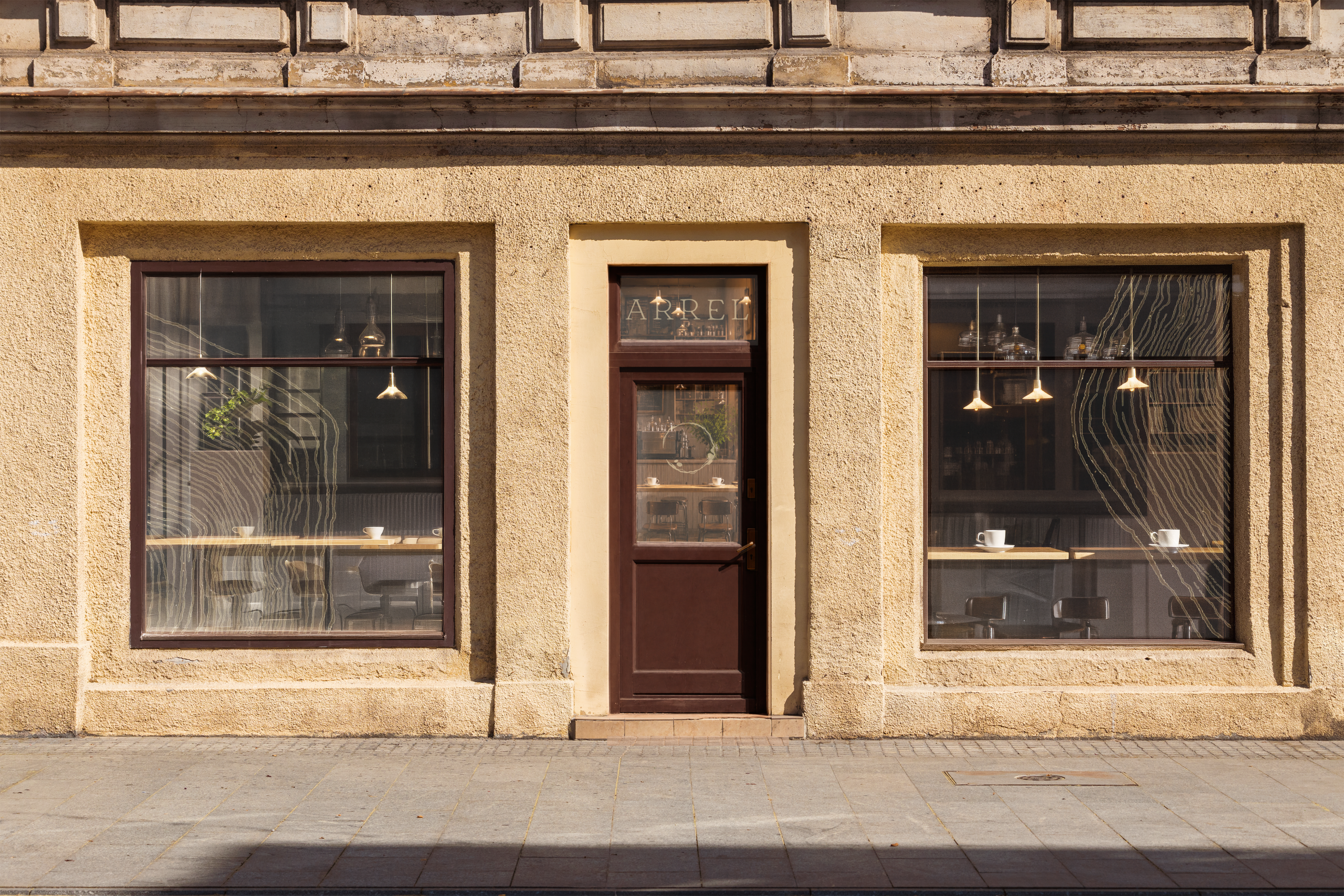
I wanted to create a place designed for disconnecting from the pace of everyday life — a space that feels calm, warm and grounded.
The name Arrel, meaning “root” in Catalan, became the starting point for the concept. It represents the feeling of finding a place where we can settle, grow and feel connected — to a space, to ourselves and to the people around us.
LEAVING A TRACE
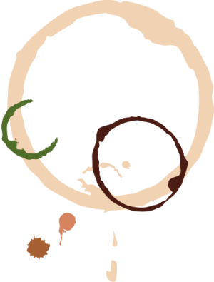
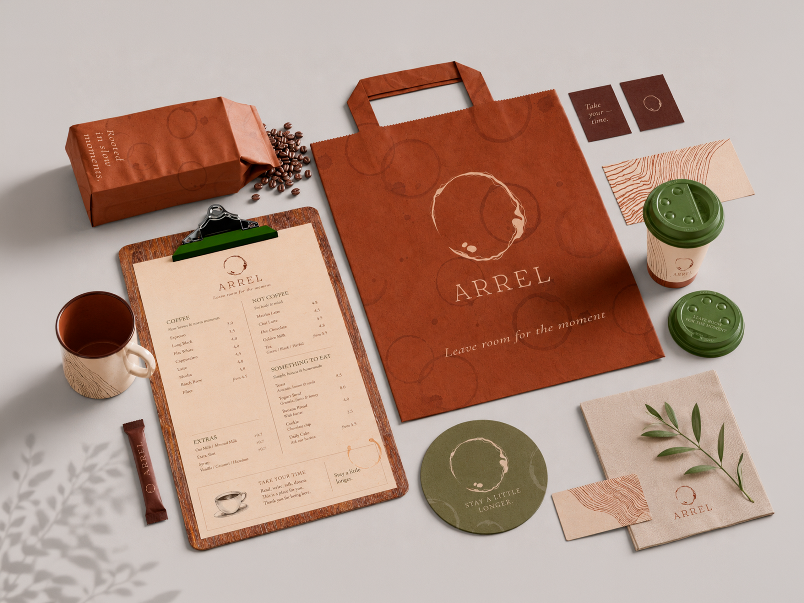
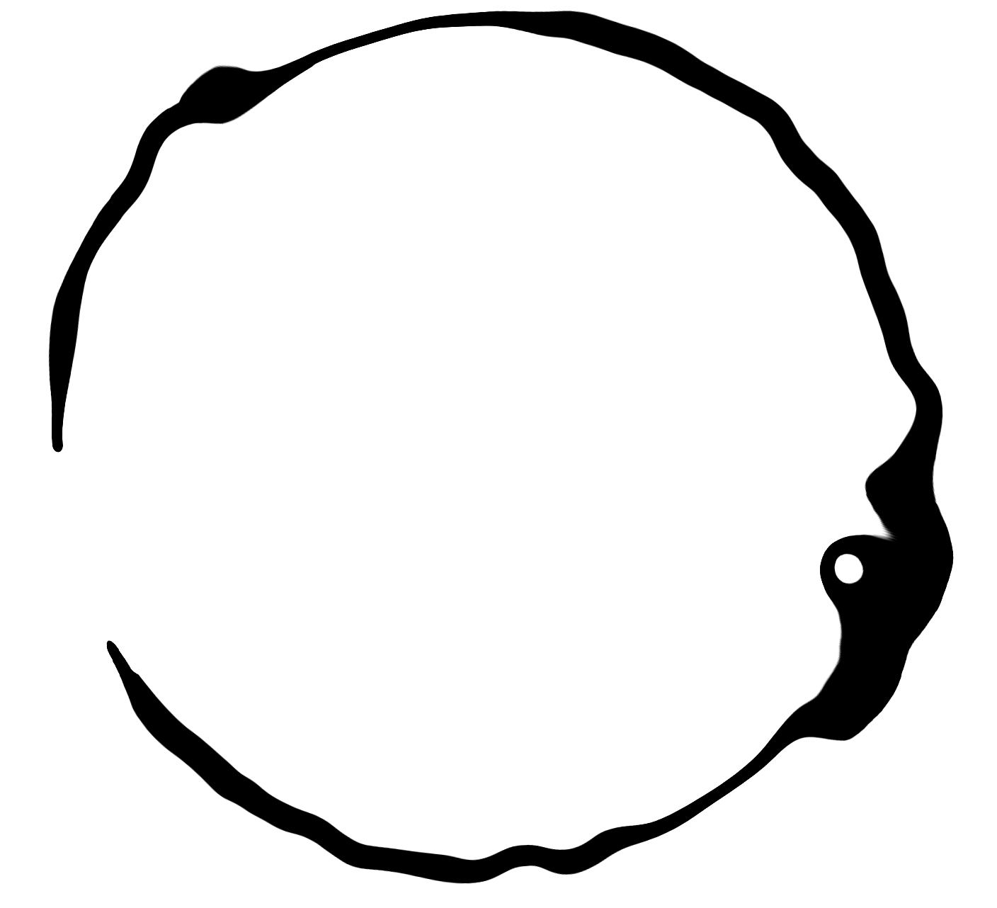
I wanted the identity to reflect how quiet moments can leave a lasting mark. I experimented with the traces left by coffee cups, using their natural rings,
stains and imperfections as the starting point for the visual language.
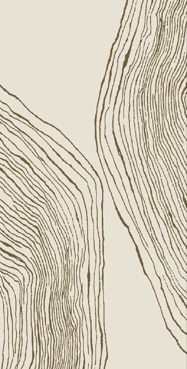
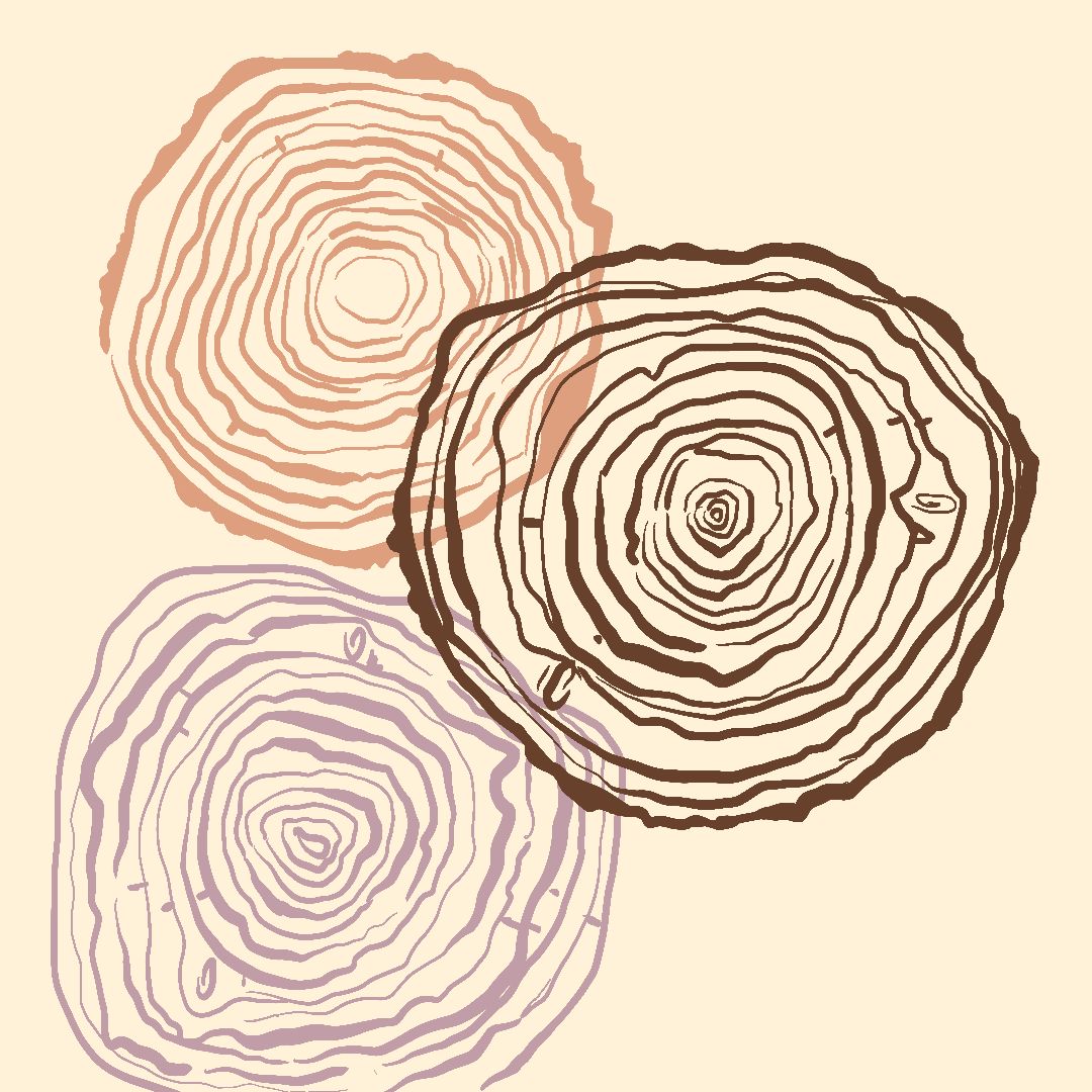
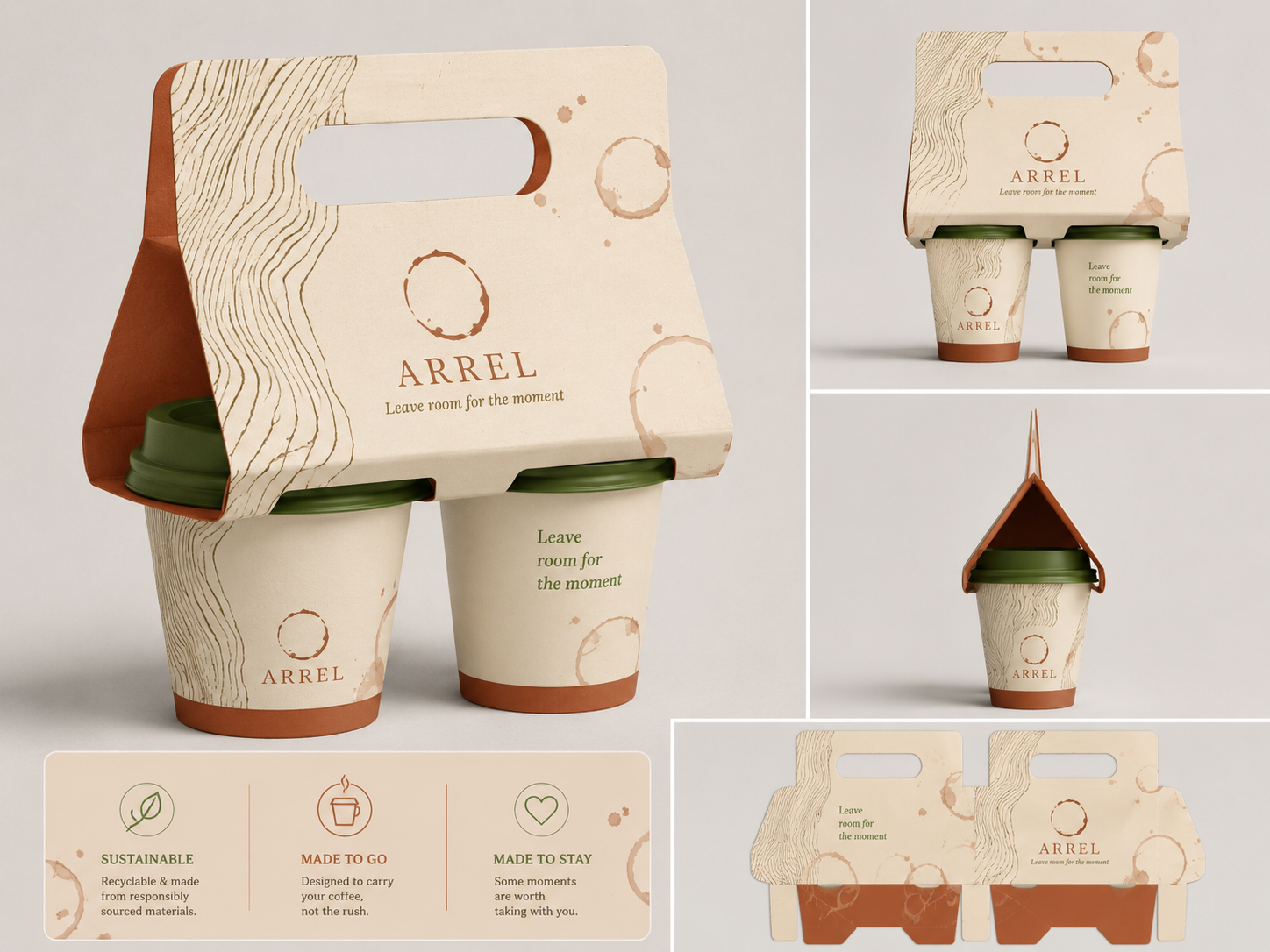
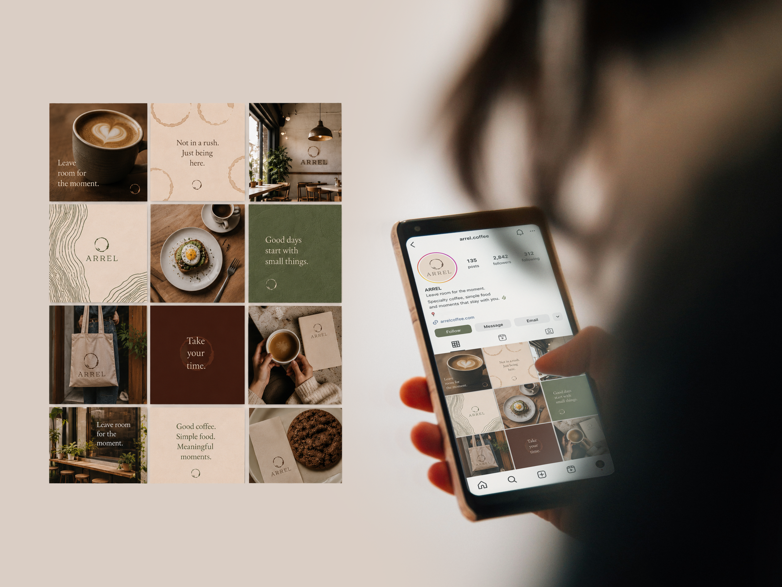
These marks became the foundation for Arrel’s organic pattern and visual identity, connecting the ideas of pause, time and human presence.
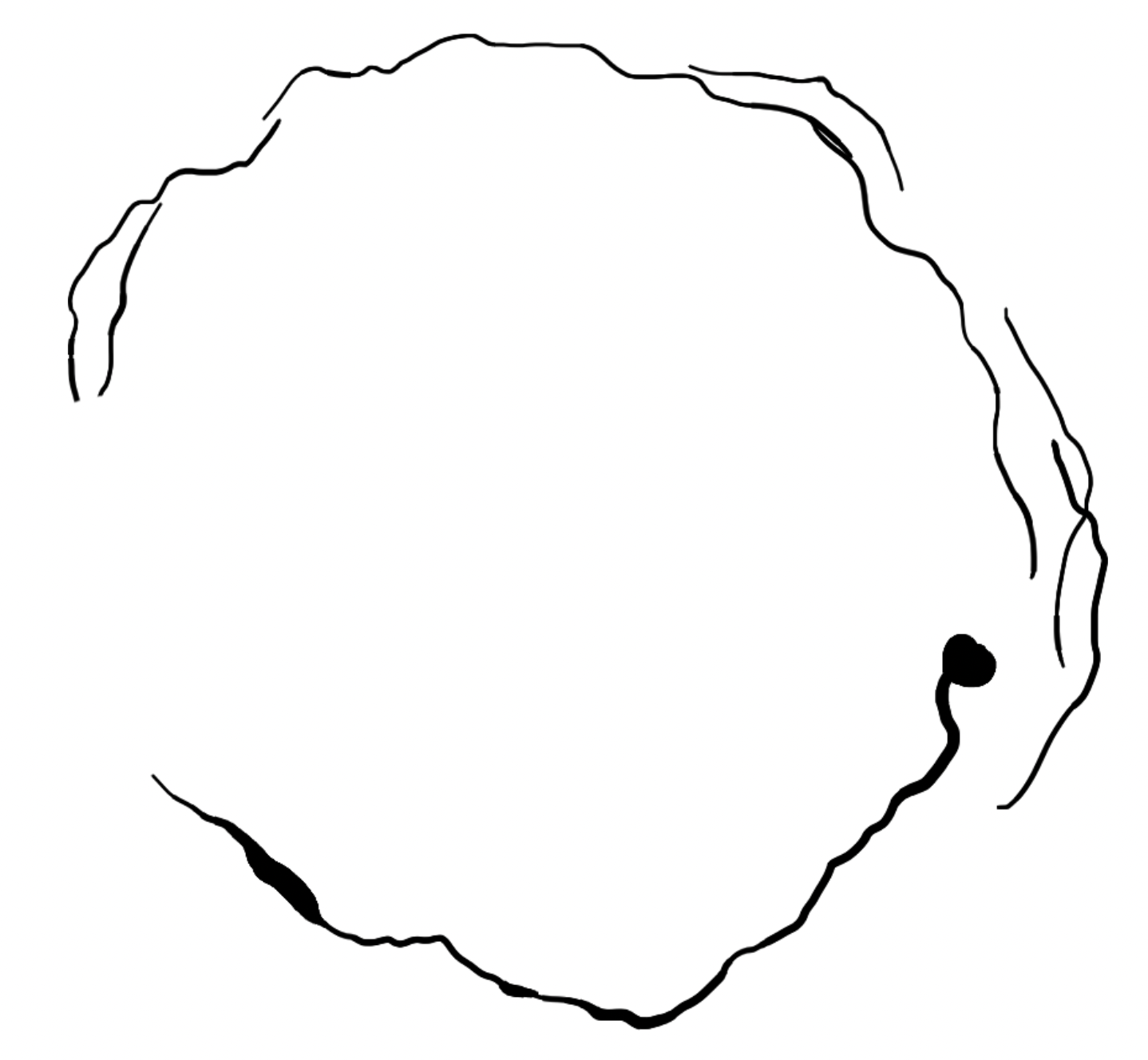
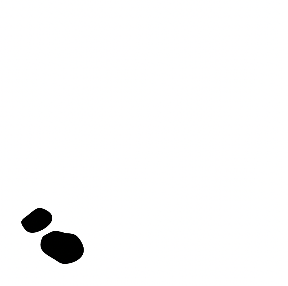
The same coffee trace became the basis for the logo. Its organic outline represents the mark left by a moment, while the fine line surrounding it introduces the idea of a root — connecting the symbol to the meaning of Arrel. The two inner marks represent companionship and connection.
DESIGNER WITH A MULTIDISCIPLINARY APPROACH
I’m a graphic and digital designer with background in 3D, animation and visual communication. I enjoy combining different disciplines to develop visual concepts, identities and digital experiences.